Previous
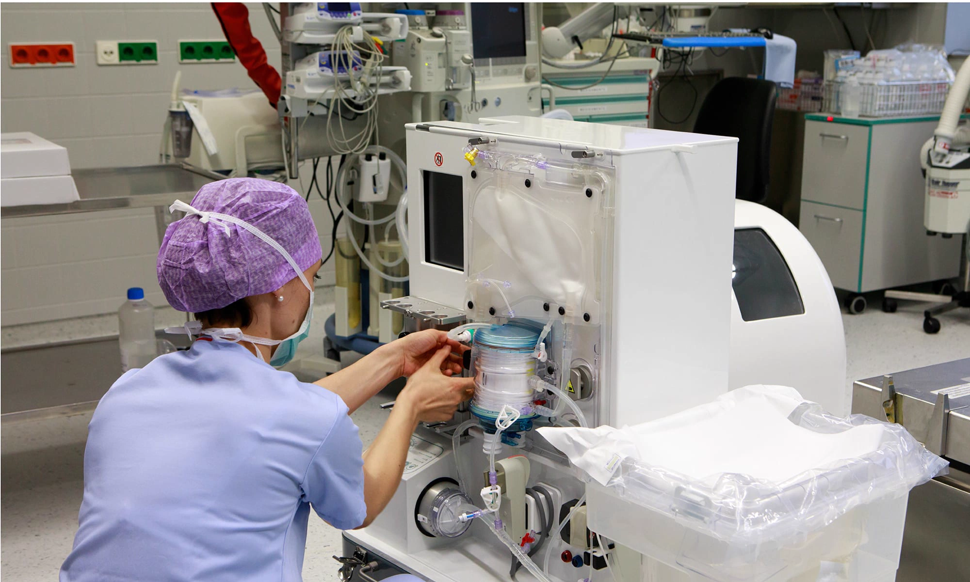
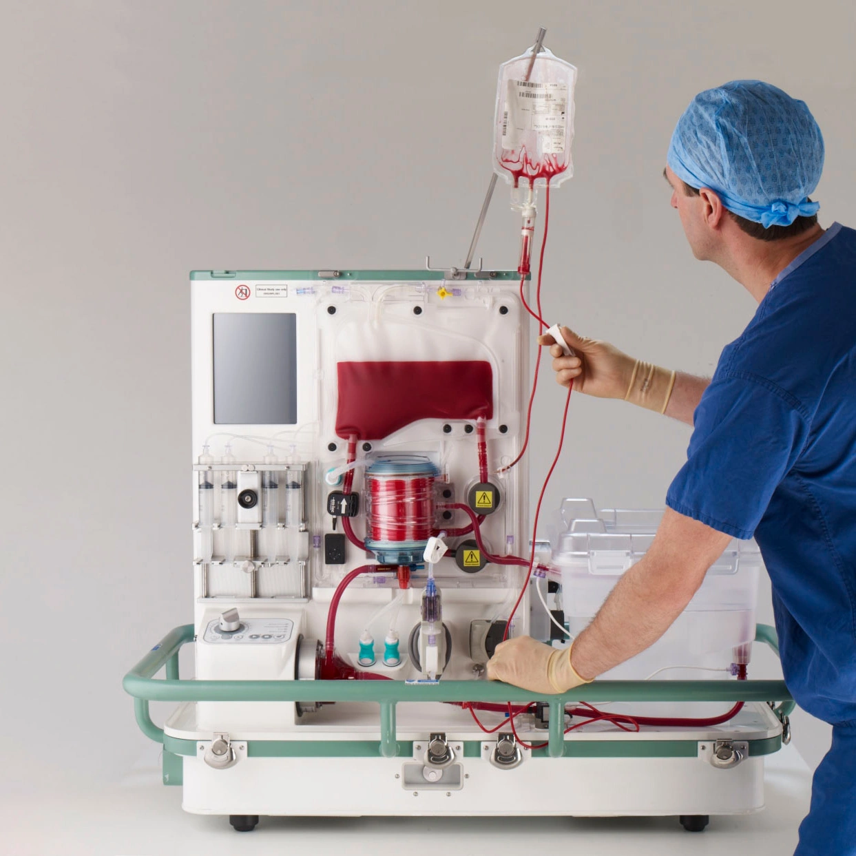
OrganOx metraOrgan perfusion system

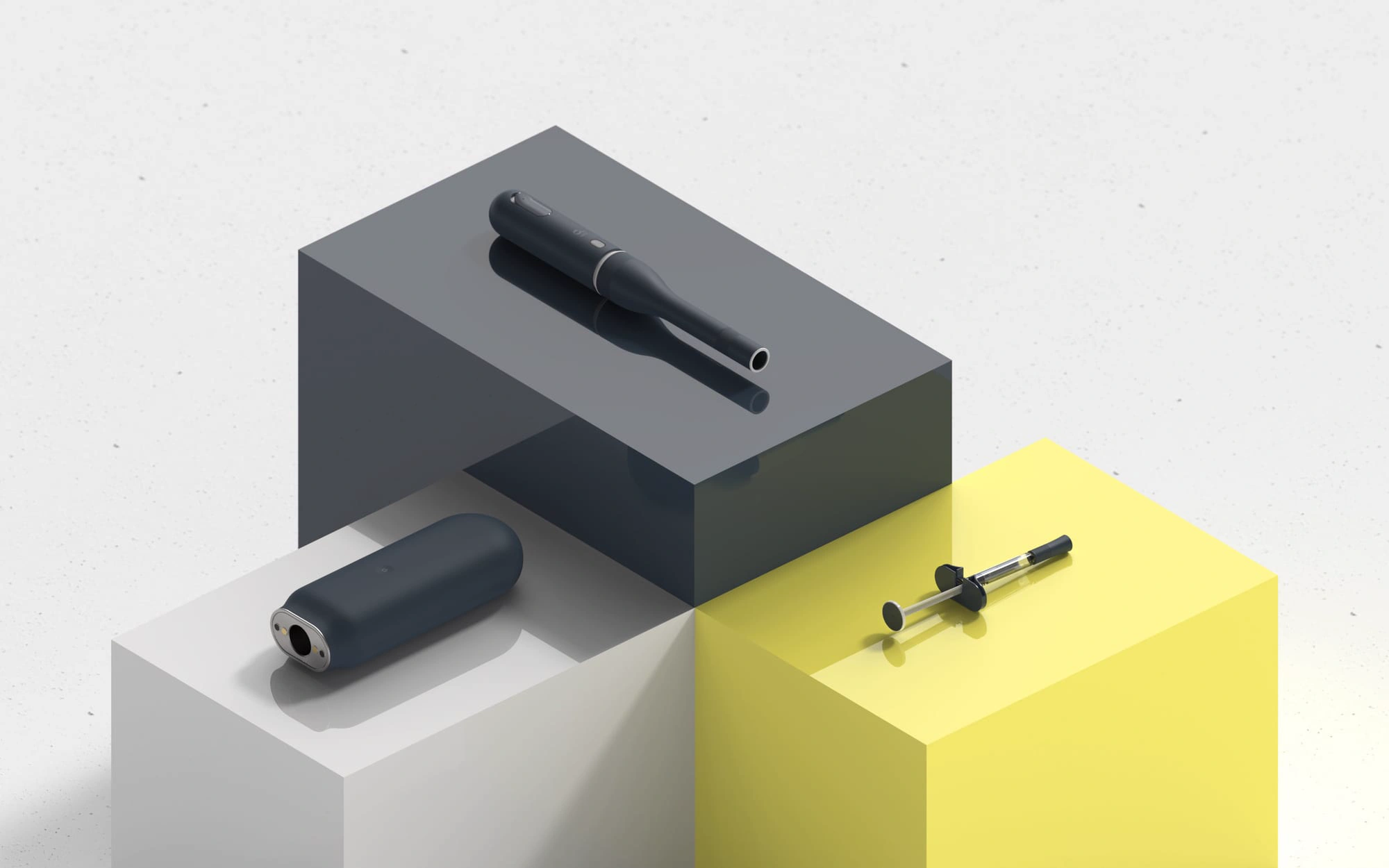
In an increasingly complex and connected world, medical products are part of an ecosystem of touchpoints - packaging, instructions for use, digital services and smartphone apps. Each can have a significant impact on a patient’s experience and their perception of a treatment.
Unfortunately, many medical products are designed by disconnected development teams with little concern for the overall patient experience. Symptoms of disparate design show up as inconsistent aesthetics, icons, colours, language, fonts and - most worryingly - interaction cues. Testing products with users indicates that a lack of harmony across touchpoints leads to disjointed, confused and ultimately poor patient experiences.
Aalto is a case study developed at Cambridge Consultants to demonstrate the benefit of integrating design across physical, digital, print and service touchpoints.
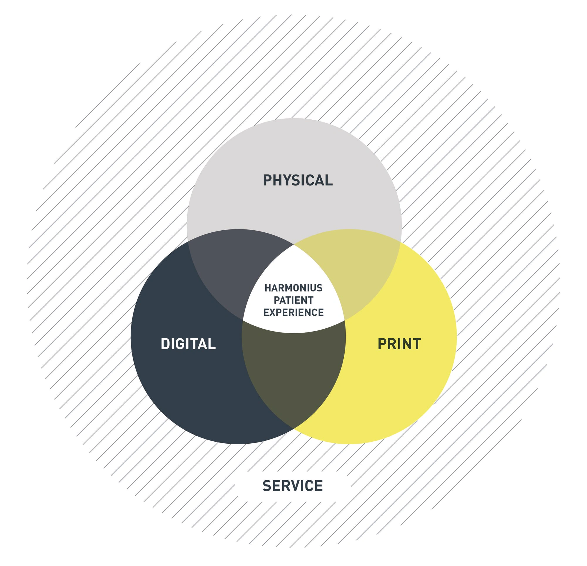
To design a harmonious patient experience, design must be integrated across physical, digital, print and service touchpoints. Designers, engineers and human factors engineers must work collaboratively to deliver a seamless design and brand experience - a key differentiator that grows and strengthens our clients’ businesses.

To demonstrate the approach, a fictional drug brand was developed for patients with a chronic disease affecting their mobility and quality of life. The brand was then translated into a design and user experience specification to guide the development of a family of injectable devices.
The brand promise - ‘calmly delivering a healthy, more active lifestyle’ - aimed to relieve patients’ anxiety about self-injection while offering hope that the medication could improve their lifestyle. The promise was divided into brand attributes that provide the key principles for design and user experience.
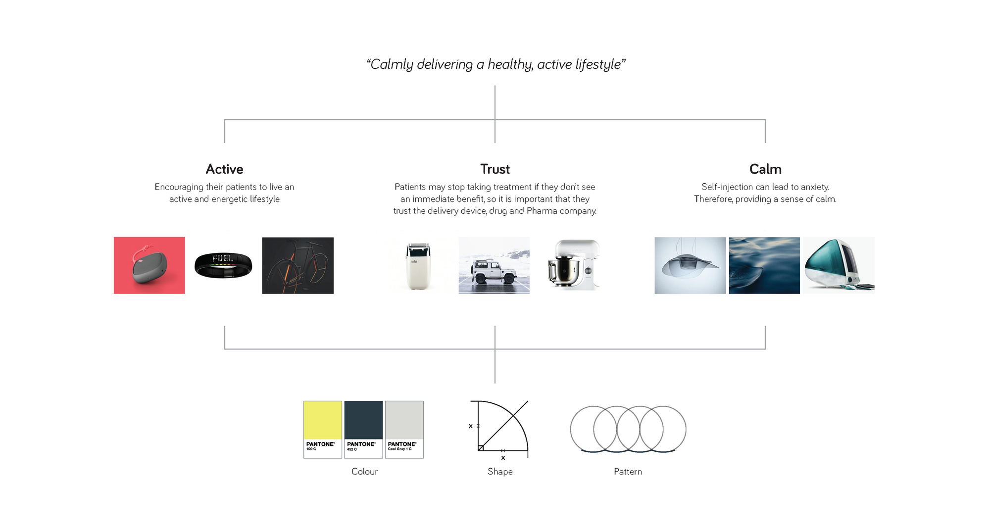
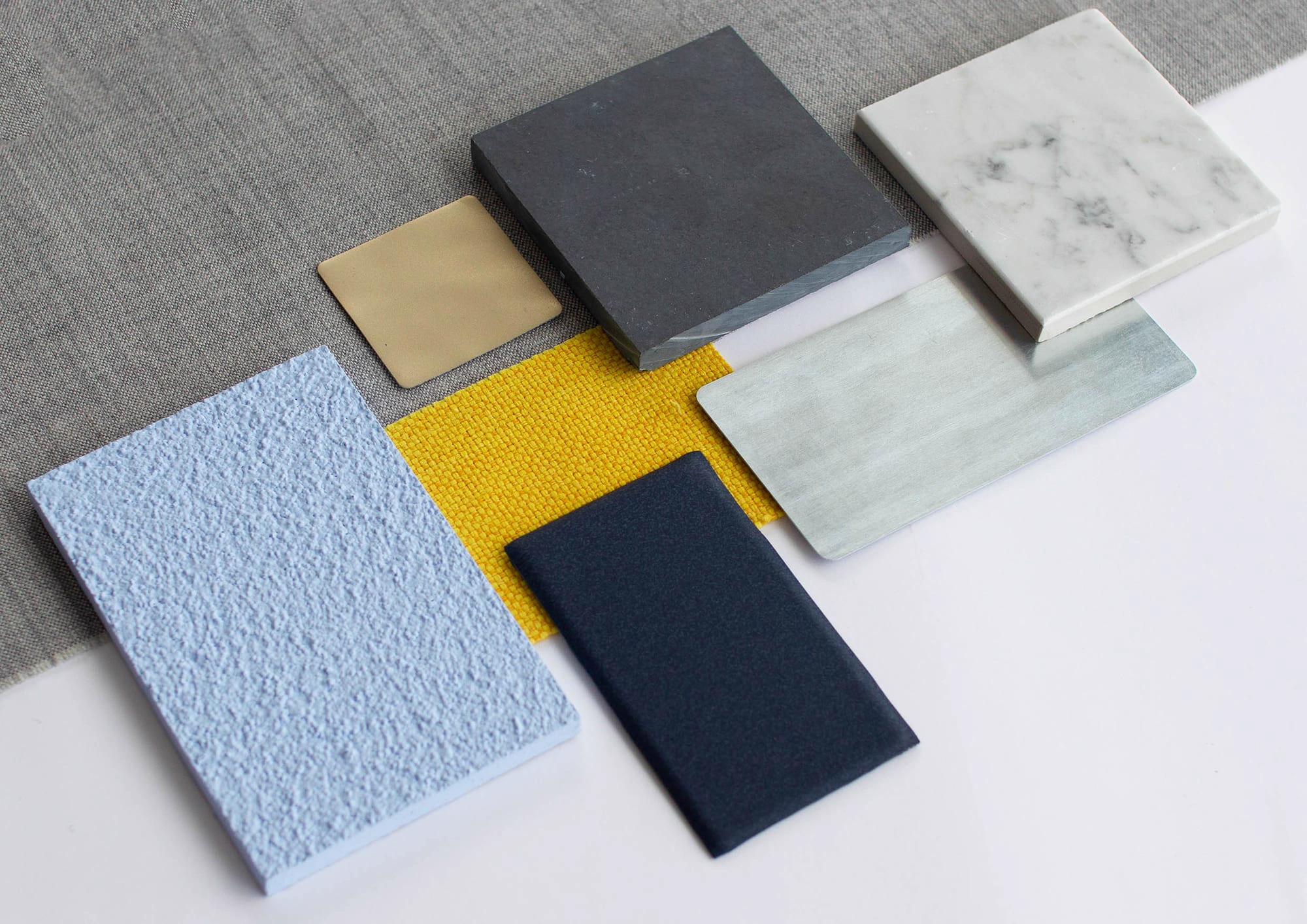
Brand attributes were translated into design attributes and signature details. Design attributes are constructed from multiple stimuli - form, colour, surface finish, material, weight, typography and tone of voice - and can be used to communicate a specific message and create an emotional connection between patient, product and brand.
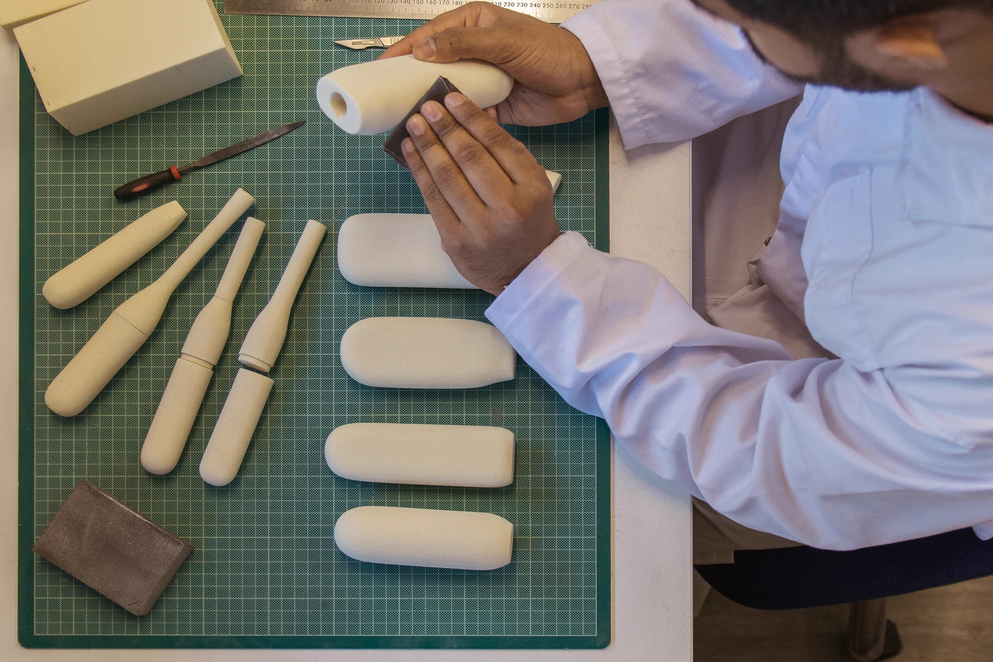
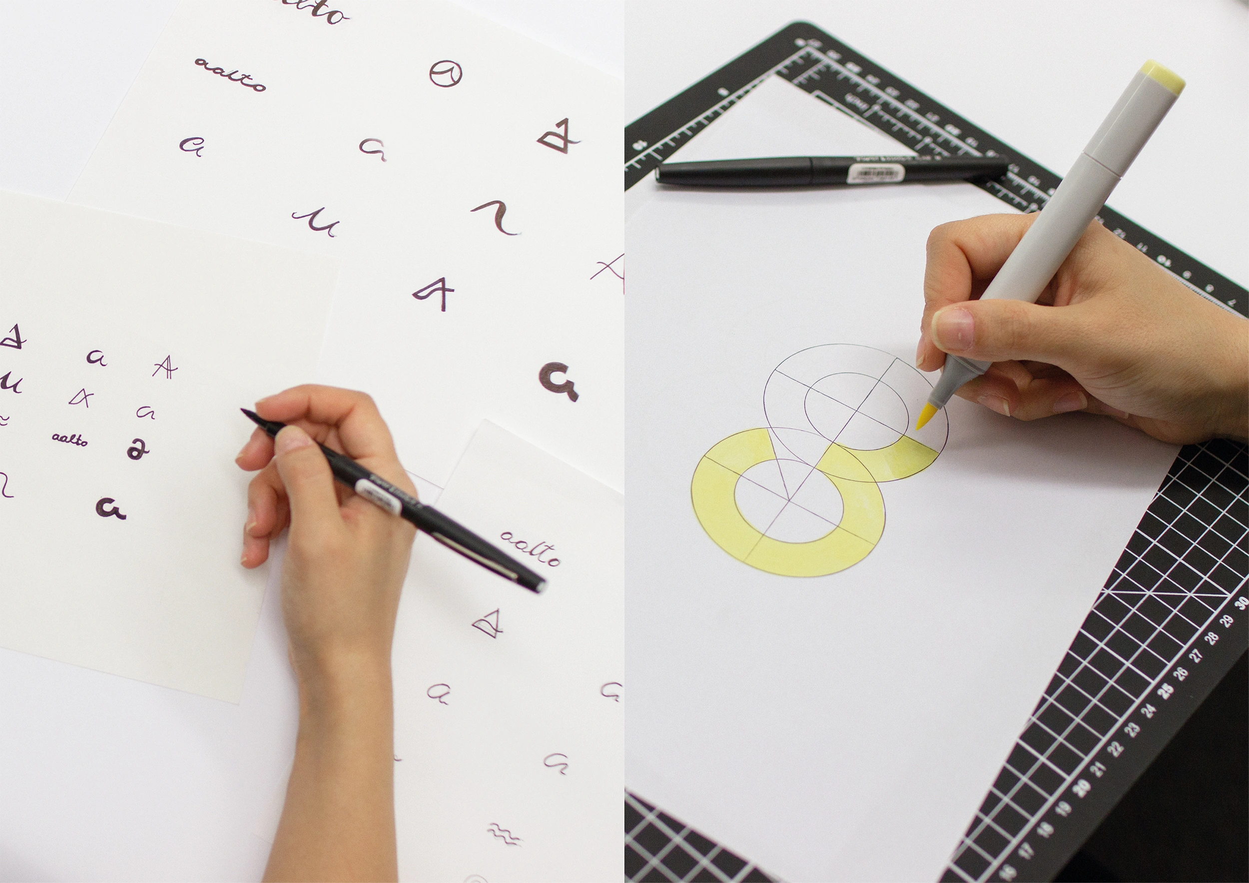
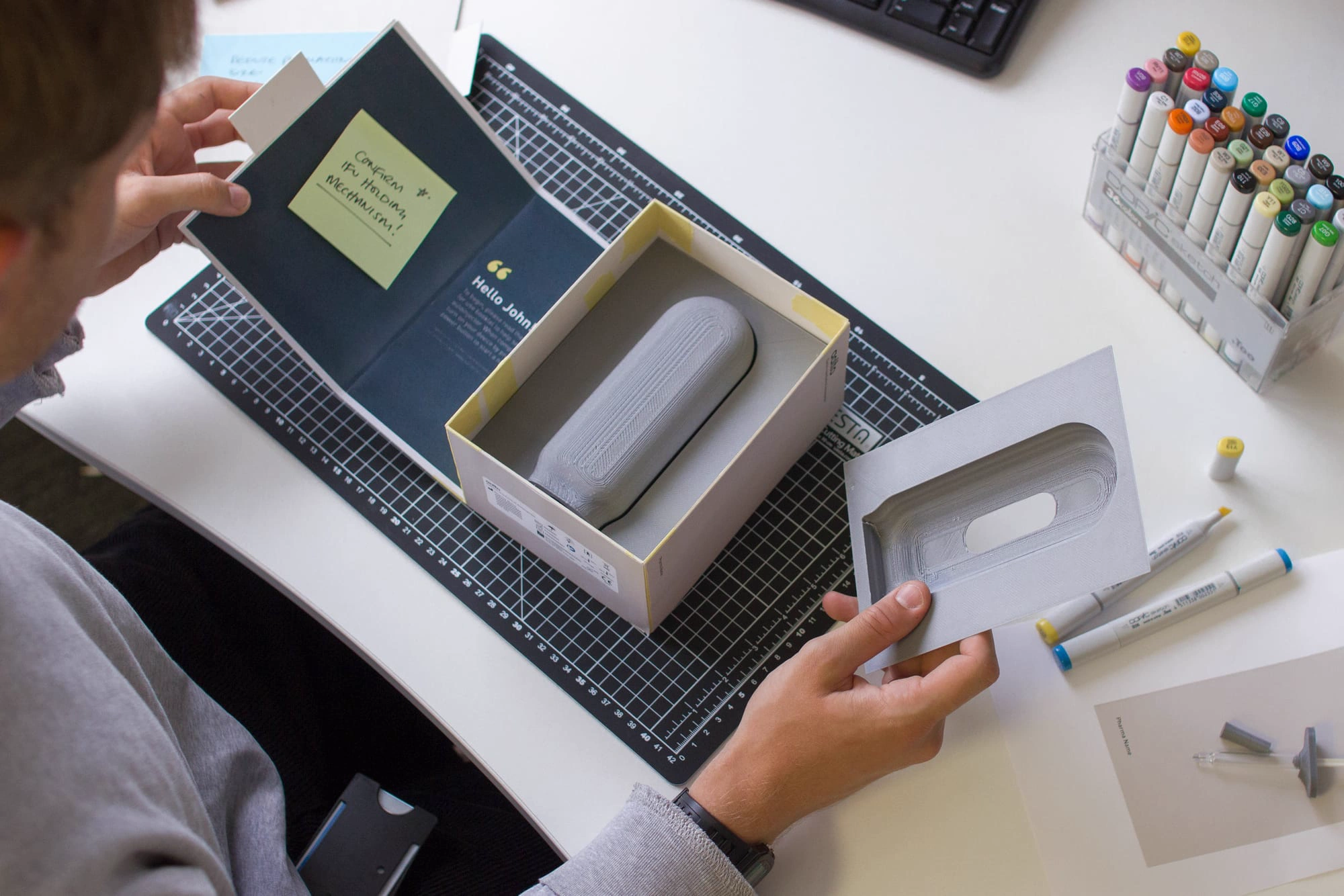
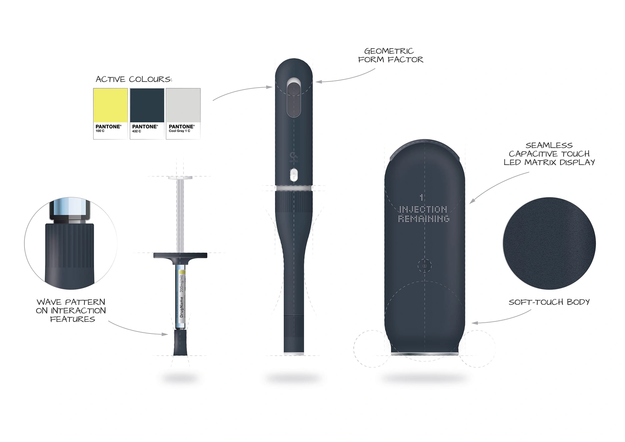
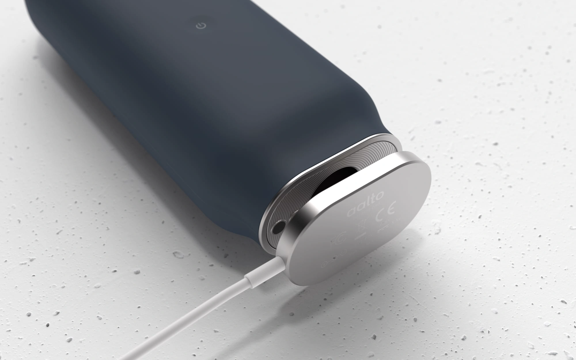
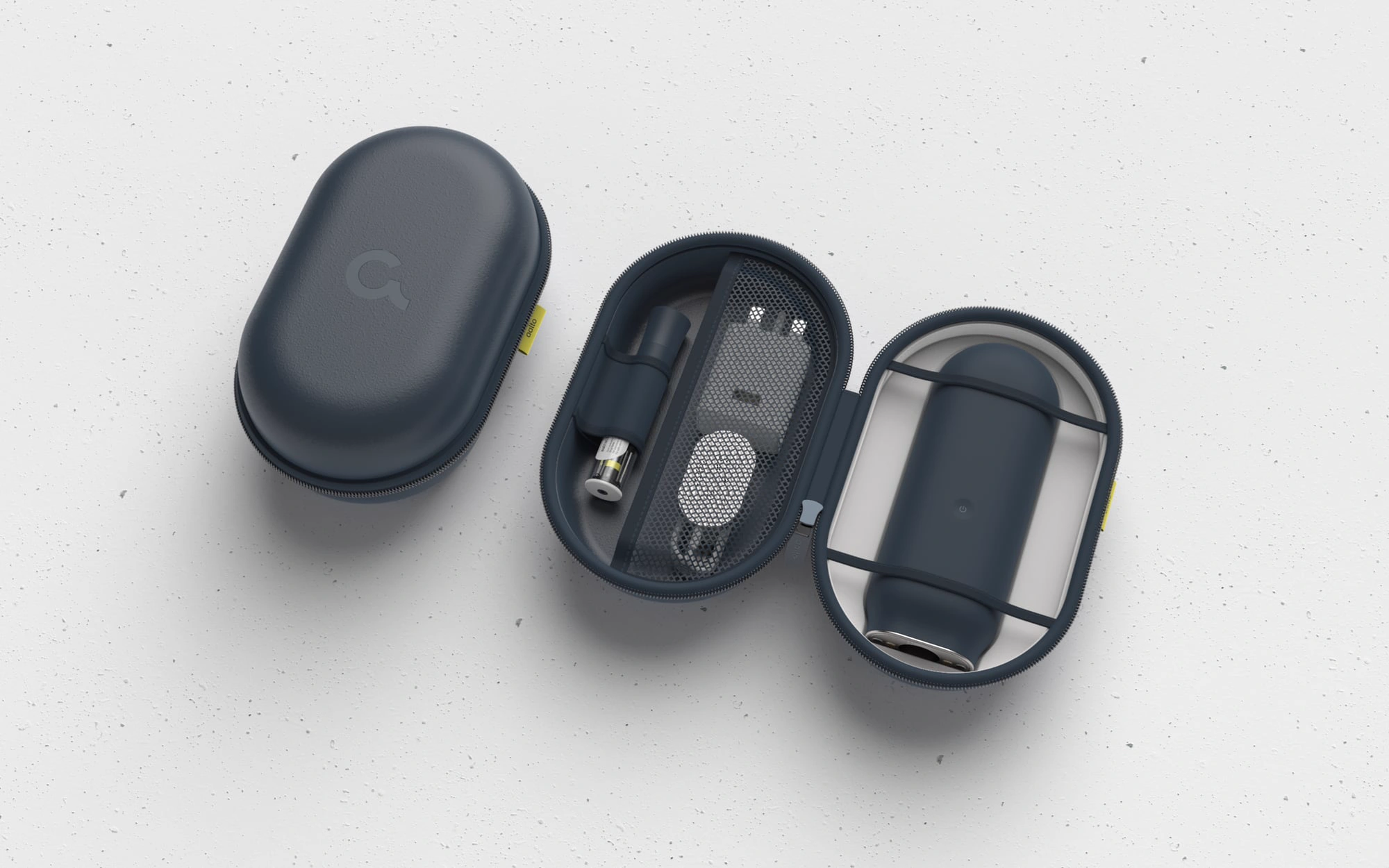
The specification guided a family of injectable devices - pen, autoinjector and wearable - together with their packaging, instructions and digital companion, so that every touchpoint speaks with the same voice.
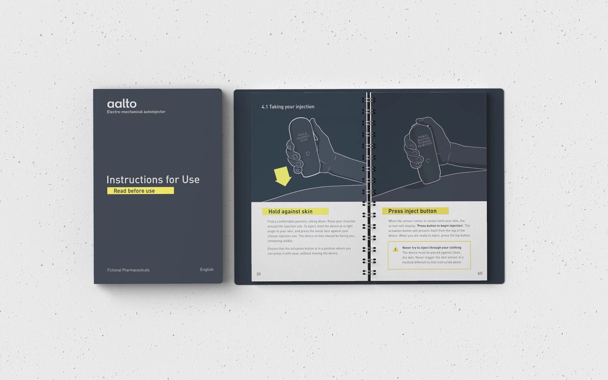
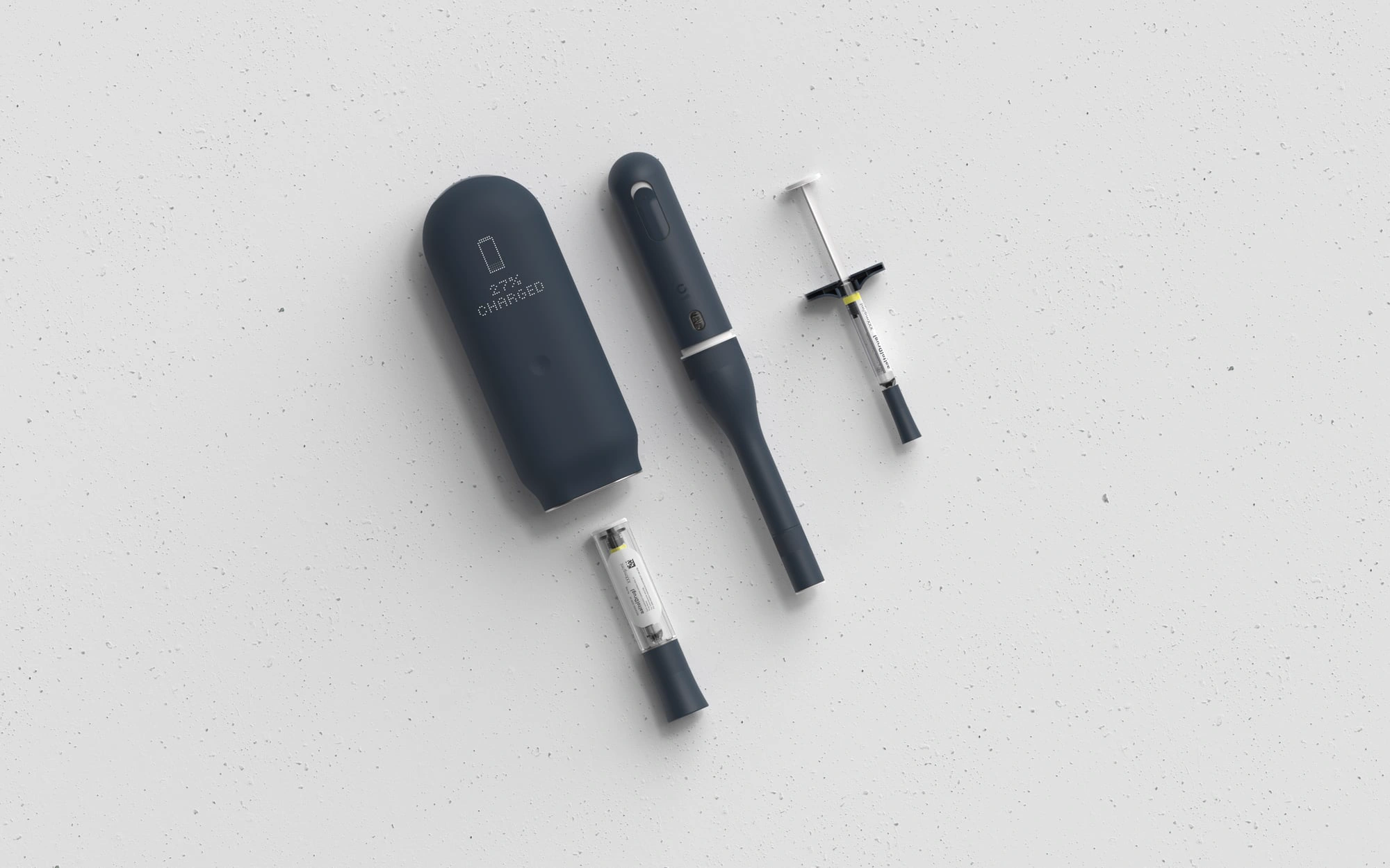
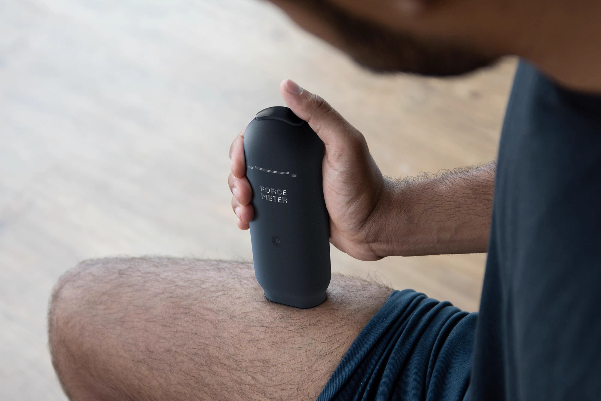
The Aalto case study demonstrates the benefit of integrated design across multiple levels and touchpoints - creating a harmonious brand experience for improved patient outcomes.
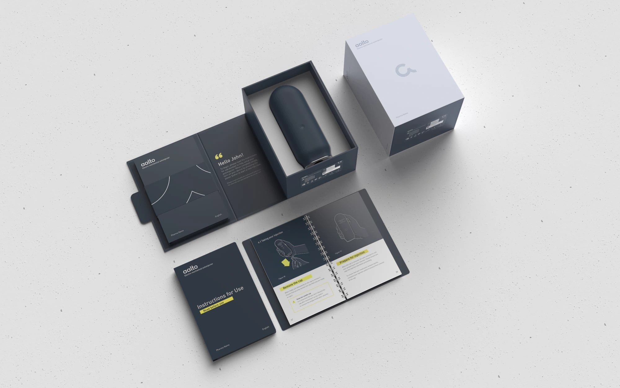
Work undertaken whilst an employee of Cambridge Consultants.
Have a medical device project in mind?